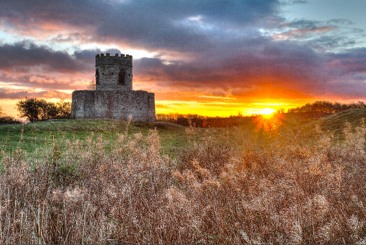
There's been a lot of talk of late about how much processing is too much processing - amongst a good mix of non-photographers, novice photographers and pretty much professionals. It's been interesting to read on the one hand and yet so frustrating on the other. So in this post - I'm going to go over the steps I took to achieve this photograph:
I don't want to cover everything - so I'll start from the basis that our eye is much, much better than a camera. Our eyes (for most of us at least) can resolve the tiniest of details, have a dynamic range (dark to light) of twice that of a camera, hardly ever result in flaring and are generally pretty spectacular. Cameras are not. So anyone who proclaims proudly "I never edit my pics..." - well, perhaps you should think about how crazy that is. Try looking at a sunset. Look at the sky, then look at the shadows on the ground - you can see both, right? Our eyes are continually adjusting, our cameras are not - those shadows would just be black. Some may disagree, but to me a photo should be as close to life like as possible. Of course, sometimes there are pressures to make things look a certain way - to get more publicity, to get more likes, to win competitions or even just to sell more prints - but that shouldn't take away from the ability to still take a brilliant photo for its own sake.
I often tell people I take three types of photo when out 'landscaping'...
- one type for me - true to life, more subtle images.
- one type for Facebook, the general public - with lots of colour and perhaps a bit overdone.
- one type that keeps both of these in mind and can be made to suit either genre.
However, even with that middle "Facebook" style shot, I still know my limits and would never aim to deceive in the final image by oversaturating, oversharpening, doing needless HDR work... it should still be true to life, just verging on the colourful side.
Now... one final definition before I move on to showing you how much goes into a single one of these shots... when I say HDR, I mean the typical "take 3 shots, shove them into Photomatix and hope for the best" style HDR. The sort that takes any skill away from getting a correct exposure in the first place and ends up with a sickly, horrible looking final image. I am all for 'careful HDR' using manually merged multiple images... as you will soon see.
The images I'll be working with were taken at sunrise up in Richmond recently - and present a whole host of problems to be fixed. The reason I've chosen this specific image is because there really is no way around some of these problems - the uneven horizon would make using filters as good as useless and due to shooting into the sun - there really is no way to expose it all in a single shot.
 |
| Example of a single shot, unprocessed - really, who wants to look at that? It's so bland, washed out and has so many problems. |
So... I start with three... the one above, one exposed for the sun, and one to remove flare. All still carefully exposed - these are not simply bracketed but chosen to individually expose for different things.
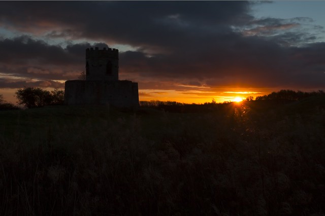 |
| The sun exposure |
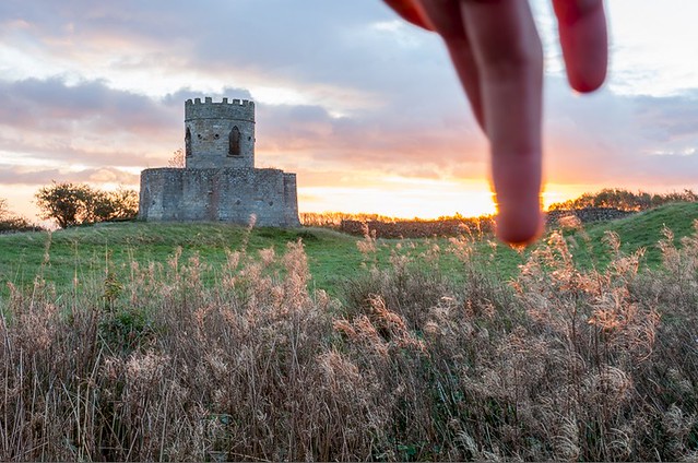 |
| The best way ever to avoid lens flare |
Notice how that third image compares to the first of the three. They are both similarly exposed but the obvious small bits of flare are now gone - along with a huge overall red/orange tint on the first image... all caused by sun light bouncing around the lens.
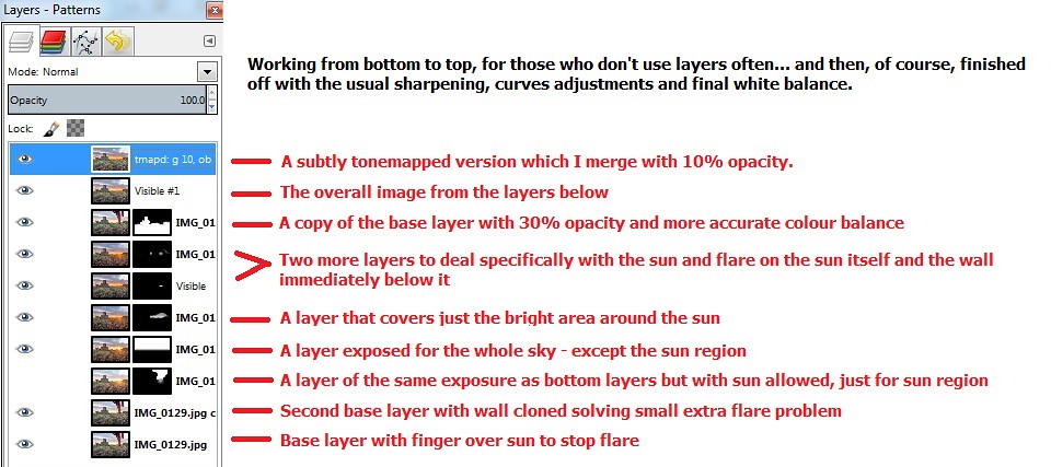
After doing the initial touch ups in Lightroom (such as sharpening, removing chromatic aberrations, correcting the white balance, correcting some highlights... all the usual stuff that some would still consider as a bad thing... "eurgh... editing...") - I move the images across to GIMP/Photoshop and get working on the layers. In this case, it required about an hour's work with 10 layers - each with masks masking out specific parts and letting other bits show through - just to get to the final image. I'm not going to go over it all in detail, but the main parts are as follows:
- Use 'finger' image as main overall image.
- Use other normal exposure image just to clone out the finger.
- Use the blown out sun region from the dark image.
- Tidy up using blends of a mix of these layers due to odd shaped horizon.
A bit more detail, and a graphic showing all these layers, is shown below:
All this, followed by yet more final touch ups... curves editing, cleaning up missed bits of flare... etc... just to end up with a single final photograph that looks pretty much true to life. Anyone else out that morning can confirm that the sunrise really was pretty vivid and spectacular, but you all saw how washed out it was in the first image of this post. Was it worth it? I'll let you decide...
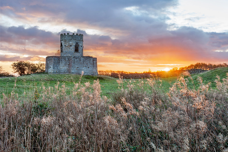 |
| The final image - no flare, smooth transitions from dark to bright, no blown out highlights and a natural look. |
The main thing I'd like to emphasise here is that all of this was pre-planned. I didn't take a scatter gun approach of exposing everything in 10 different exposures and hope I'd work it out afterwards. I took just the exposures I needed, exposed as perfectly as they could be, and knew exactly what process I'd go through when I got home - reconstructing the view my eyes saw in that beautiful moment from some carefully selected snapshots of the moment.
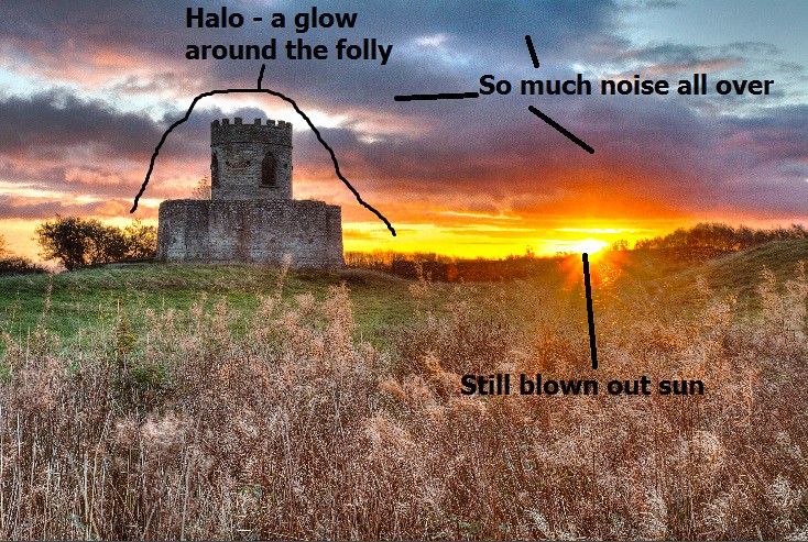
Finally... for completeness... here's what it would have looked like if I'd done the usual style (slightly rushed) HDR on it... bleurgh.
I only did this with small images to save time - but all the usual problems have shown themselves... see the lighter glow around the folly where Photomatix has done a less than perfect job on the blending? What about the noise everywhere where it's picked pixels from the darker (noisier) image and mixed them in with the normal one? Even with all this, the sun is still blown out too!
Worst of all, you can clearly tell the processing of this. When you see this kind of HDR you know instantly how it was done, but I bet nobody could have guessed the process to my original shot? I hope, at least - as if you can't tell what has been done, then it's usually a good sign that the photo is believable - which is exactly what is wanted in order to hold your gaze and interest you for a while.

No comments:
Post a Comment